tabletops |
 |
 |
 he subcompact cars of the exhibit industry, tabletop exhibits are not only lightweight, easy to maneuver, and cost efficient, but these nimble minis can go almost anywhere Hummer-size exhibits dare to tread — and even some places they can’t, such as tabletop-only shows, career and university fairs, and chamber events. he subcompact cars of the exhibit industry, tabletop exhibits are not only lightweight, easy to maneuver, and cost efficient, but these nimble minis can go almost anywhere Hummer-size exhibits dare to tread — and even some places they can’t, such as tabletop-only shows, career and university fairs, and chamber events.
Similar to their four-wheeled counterparts, however, tabletops often have serious identity issues. Surrounded by Mack-truck exhibits with 10-ton budgets, or adrift in a sea of sameness filled with lane after lane of similar subcompacts, tabletops need to be spot-on effective to keep from becoming hopelessly lost in the crowd —
or run off the ROI road by a road-hoggin’ dually.
To help you get the most out of your tabletop exhibit, EXHIBITOR asked 10 exhibit-marketing experts how to create and manage an effective tabletop exhibit. While their answers centered on a single word — “Simplify!” — experts also offered the following 10 tips and techniques to help you create a Cadillac Escalade presence with a Mini Cooper exhibit.
|
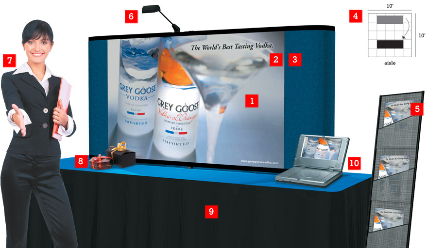
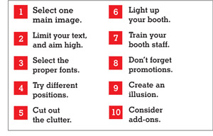
 Whether panel systems or pop-ups, effective tabletop exhibits are little more than traveling graphic panels. Thus, effective graphics are paramount to your program’s success. Whether panel systems or pop-ups, effective tabletop exhibits are little more than traveling graphic panels. Thus, effective graphics are paramount to your program’s success.
“Above all, tabletop graphics must communicate who the exhibiting company is and what it does at a glance,” says Mel White, vice president of marketing and business development at Classic Exhibits Inc., an exhibit house in Portland, OR. “If your graphics don’t pop and your message isn’t compelling, you’ve lost attendees before your opening line.”
According to Randy Harju, principal at exhibit house 3DL Design Inc. in Mundelein, IL, the best way to relay your message is with one large image. “When it comes to images, bigger is better,” Harju says. “You want one big, main image filling the main part of your graphic display. If you simply must have additional smaller images, stick them in your literature.”
 “If your text takes more than three seconds to read, you’ve got too much,” says Chuck Michel, manager of business development at St. Louis graphics firm Group 360 Communications. That means a tabletop graphic should feature roughly six to 10 words and a company logo. This text should complement the image to create a cohesive message. “If your text takes more than three seconds to read, you’ve got too much,” says Chuck Michel, manager of business development at St. Louis graphics firm Group 360 Communications. That means a tabletop graphic should feature roughly six to 10 words and a company logo. This text should complement the image to create a cohesive message.
With only a handful of words in your arsenal, message selection is critical. “Attendees only want to know what’s in it for them,” says Susan Shuttleworth, marketing manager at Hummelstown, PA-based TransCore. “For example, tell attendees your product ‘Cuts transportation costs by 20 percent!’ or that it can ‘Double your ROI.’ But don’t list product numbers and specs. Attendees don’t care.”
After selecting your image and text, the next step is positioning them on the graphic panels. Adam Brodsley, principal of San Francisco exhibit-design firm Volume Inc., says that the 2-foot zone across the top of the exhibit is the ideal location for key information. “It’s really the only unobstructed area people can see clearly in an aisle full of attendees,” he says.
 “Graphics text should be easy to read, not artsy,” Michel says. “Your images, not your text, are your art, which means artsy fonts are unnecessary.” Artsy fonts fight for attention against the image and distract the reader by pulling the eye back and forth. “Graphics text should be easy to read, not artsy,” Michel says. “Your images, not your text, are your art, which means artsy fonts are unnecessary.” Artsy fonts fight for attention against the image and distract the reader by pulling the eye back and forth.
“When it comes to color selection, text color must provide a sharp contrast with the background in order to have full effect,” says Gwen Parsons, senior vice president of Nomadic Display, a portable- and modular-exhibit provider in Springfield, VA. “One must place text on a case-by-case basis, simplify the overall amount of text, and avoid using busy backgrounds.” Safe color combinations typically include dark colors on light backgrounds as well as light colors on dark backgrounds. Michel, however, warns against using red on blue or black on any dark color. “And always be careful when you float text over an image or a background that varies in color, as both situations can cause readability issues,” Michel says.
When it comes to text size, some experts suggest adhering to the 10-by-10 rule, while others suggest breaking it.
“A typical rule of thumb for 10-by-10 graphics is that your headline text must be a minimum of 4-inches tall to be seen from the aisle, and body text should be 2-inches tall,” says Geoff Kilmer, president of graphics house Photoworks Creative Group in Charlottesville, VA. But, according to Harju, you might be able to get away with smaller text depending on the placement of your booth within the space.
 Most people assume a tabletop exhibit should be positioned at the back of a 10-foot space. However, Harju suggests you consider alternative booth placement. A typical 10-by-10 pop-up is usually positioned at the back of a 10-foot space, providing more than 10 feet of separation between attendees and your text. Sometimes — such as at small city-specific shows or chamber events — tabletops are placed 3 to 4 feet from the aisle, Harju says. Thus, attendees are much closer to your text, which means text size can be a bit smaller than normal. Most people assume a tabletop exhibit should be positioned at the back of a 10-foot space. However, Harju suggests you consider alternative booth placement. A typical 10-by-10 pop-up is usually positioned at the back of a 10-foot space, providing more than 10 feet of separation between attendees and your text. Sometimes — such as at small city-specific shows or chamber events — tabletops are placed 3 to 4 feet from the aisle, Harju says. Thus, attendees are much closer to your text, which means text size can be a bit smaller than normal.
“If show management allows, consider pulling the tabletop closer to the aisle,” Harju says. “The closer it is to the aisle, the easier it is for people to read.” Many people see the booth/aisle line as a psychological barrier preventing them from entering the space. Moving the booth to the front of the space often eliminates this invisible barrier.
“Typical show regulations allow you to position an 8-foot tall tabletop exhibit 2 feet out from the back of the space,” Harju says. “However, small shows often relax this regulation, or you can request special permission to bypass this guideline.”
Remember, staffers and attendees need room to maneuver in the booth, and passersby still need to read your graphics. Thus, before you position the tabletop within the space, carefully consider your graphics, audience, and type of attendee interaction.
 “When it comes to additional exhibit elements, if it doesn’t communicate a message, it’s got to go,” Harju says. “When it comes to additional exhibit elements, if it doesn’t communicate a message, it’s got to go,” Harju says.
For exhibitors, then, that means chairs, tables, desks, and all other ancillary items must go. The only item our experts recommend adding (aside from minor items mentioned in No. 8 and No. 10) is a literature stand.
If only one person is staffing the booth, he or she can usually handle only one attendee at a time, leaving passersby to fend for themselves. Rather than allowing attendees to wander off without a stitch of contact information, busy staffers can hand them literature to peruse while they finish talking.
If you’re distributing literature, Parsons recommends using a folding, vertical literature stand. Such a stand is lightweight and easy to transport.
|
Tabletop Tutorial
Generally speaking, tabletops come in three varieties: panel systems, pop-ups, briefcases. Here’s a down-and-dirty guide to these common tabletop structures.
 Panel Systems — Usually constructed of hard-surface squares or rectangles connected by hinges, most panel systems simply unfold and stand upright. The panels are typically covered with fabric, and the graphics are attached to the panels using hook-and-loop fastener. Panel Systems — Usually constructed of hard-surface squares or rectangles connected by hinges, most panel systems simply unfold and stand upright. The panels are typically covered with fabric, and the graphics are attached to the panels using hook-and-loop fastener.
 Pop-up Systems — These typically consist of a frame made from lightweight flexible tubes and connecting joints. Graphics are applied to the frame using magnetic strips, or graphics are attached to a fabric cover via hook-and-loop fastener. Pop-up Systems — These typically consist of a frame made from lightweight flexible tubes and connecting joints. Graphics are applied to the frame using magnetic strips, or graphics are attached to a fabric cover via hook-and-loop fastener.
 Briefcases — Briefcase tabletops are slightly larger than a briefcase. They’re most often used for city-specific shows or sales calls. Graphics are attached to fabric with hook-and-loop fasteners, or graphics panels are inserted into channels in the frame. Briefcases — Briefcase tabletops are slightly larger than a briefcase. They’re most often used for city-specific shows or sales calls. Graphics are attached to fabric with hook-and-loop fasteners, or graphics panels are inserted into channels in the frame.
|
 “The decision whether or not to light your exhibit is simple: Do you want people to see your graphics, or don’t you?” says Paul Fine, president of lighting firm Fine Design Associates Inc. in Doylestown, PA. “The decision whether or not to light your exhibit is simple: Do you want people to see your graphics, or don’t you?” says Paul Fine, president of lighting firm Fine Design Associates Inc. in Doylestown, PA.
For each tabletop, Fine recommends using two 100- or 200-watt halogen lights spaced 2 to 3 feet apart. For optimum coverage, position the lights 2 feet out from the graphics.
Also consider tabletop styles with built-in lighting effects. “We can add a bubble, back-lit panel to our pop-up systems,” says Mike Thimmesch, director of marketing communications at Skyline Exhibits in St. Paul, MN. “Rather than the graphic panel curving in toward the frame, one panel can be convex and stick out from the frame, creating a pocket behind it for a light fixture.”
 “For many tabletop exhibitors, staffing is an afterthought,” White says. “However, aside from your graphics, your staff is all you’ve got — which means they’re absolutely critical to your success.” “For many tabletop exhibitors, staffing is an afterthought,” White says. “However, aside from your graphics, your staff is all you’ve got — which means they’re absolutely critical to your success.”
Often, staffers are local sales reps who have no idea how to staff a booth. Thus, not only must you select staffers that understand your mission and its importance, but you must also teach them about everything from how to open a conversation and qualify leads, to how to pack up the booth and get it to the receiving dock.
When considering the number of staffers, “two staffers in the booth at the same time is too many,” Harju says. “The ideal situation is to have two staffers, but to have one in the booth and one walking the floor. That way, they can trade places, take breaks, and offer assistance, but they never crowd the attendees out of the booth.”
 Similar to all other exhibits, tabletops are merely marketing vehicles, which means you still need to create pre-, at-, and post-show promotions and follow up on the leads. Similar to all other exhibits, tabletops are merely marketing vehicles, which means you still need to create pre-, at-, and post-show promotions and follow up on the leads.
Dick Wheeler, president of Professional Exhibits & Graphics in Sunnyvale, CA, thinks giveaways are particularly effective in exhibits in general, and tabletops in particular. “Even if you think giveaways are gimmicky, everybody still loves getting something for free,” he says. “Offering something as simple as a clever T-shirt or even a piece of quality chocolate can be enough to set yourself apart from the competition. The only cautions are that the giveaway should somehow tie to your company and message, and should match your company’s image and attendees’ expectations.”
When it comes to pre- and post-show mailers, Thimmesch offers a helpful hint. “If you’re exhibiting at small tabletop-only shows, for example, it’s not cost effective to create a different mailer for each show. So determine how many shows you’ll do each year, design one mailer for all of them, and then simply change the booth and show number for each printing. Or, you can keep the same mailer and simply attach a different show-specific sticker that lists the show name and your booth number. This way, you’ll get a bulk rate for design and perhaps for printing as well.”
 One way to create a bigger presence is to purchase a table skirt that matches the main color of your exhibit. “If you use a logo-imprinted table skirt in the same color and style as your graphics, it creates the illusion of having a full-height 10-by-10 exhibit, as you’re using the entire space from the floor to the top of your tabletop,” says White. One way to create a bigger presence is to purchase a table skirt that matches the main color of your exhibit. “If you use a logo-imprinted table skirt in the same color and style as your graphics, it creates the illusion of having a full-height 10-by-10 exhibit, as you’re using the entire space from the floor to the top of your tabletop,” says White.
Text below waist level, i.e. anything printed on a table skirt, has minimal visibility on a busy show floor. However, rather than using show-provided skirts, which are often tattered and stained, and which come in colors that match the venue’s carpet and linens rather than your exhibit, a matching-colored skirt (minus your text or logo) creates the illusion of a larger presence.
Another illusion to consider involves carpet color. Granted, sometimes you’re forced to use garish, casino-style carpet already present in the venue. However, if you have a choice, match your exhibit carpet to the aisle carpet. Matching aisle and booth carpet eliminates the psychological barrier that keeps some attendees from entering your space. (See tip No. 4.)
 Experts once again urge exhibitors to “Simplify!” when it comes to add-on features. However, once in a great while, an additional element may be warranted. Here are a few options. Experts once again urge exhibitors to “Simplify!” when it comes to add-on features. However, once in a great while, an additional element may be warranted. Here are a few options.
 Headers. When it comes to headers (graphics panels positioned across the top of an exhibit), the jury is still out, as two experts hold dissenting views. While White feels that “graphic headers are critical to getting noticed,” Harju dislikes headers “because they’re just not simple. You might generate attention with a header,” Harju says, “but now you’ve got another piece to move, and something extra to assemble.” Headers. When it comes to headers (graphics panels positioned across the top of an exhibit), the jury is still out, as two experts hold dissenting views. While White feels that “graphic headers are critical to getting noticed,” Harju dislikes headers “because they’re just not simple. You might generate attention with a header,” Harju says, “but now you’ve got another piece to move, and something extra to assemble.”
Presentations and Monitors. If you have a product that’s difficult to explain, or you’d simply like to add a bit of movement to your space, try adding a short presentation or video shown on a small, portable monitor. “A small-screen presentation provides another avenue for getting your message across,” Harju says. “But keep the monitor in scale with a tabletop, something such as a 6-by-8 -inch portable DVD player.”
Product Shelves. Some tabletops offer attachable shelving systems to display small products. But be sure your products add to, rather than distract from, the display, and that they balance on the shelves. e
|
|
|
|